Every day, several new products are launched in the market, some from start-ups. For product startup brands, if they want to get into large retailers like or , it cannot be achieved unless they set a good base, meaning to have an established sales trend.
Crowdfunding is proving to be a viable way a product startup can get sales (and develop a baseline), test new concepts and even raise funds. Crowdfunding can even help a product startup to pre-sell its products before they start the manufacturing process. In crowdfunding, a great idea is presented to potential end-customers and if they like it, they will pre-order or even make monetary contributions to help transform the idea into something tangible. This is an avenue that product startups should adopt. Here are some reasons product startups should borrow from those who have successfully launched crowdfunding campaigns.
Presented with a Huge Marketplace
estimates the popular crowdfunding platforms Indiegogo and Kickstarter attract more than 60k visitors every month. This is huge traffic, and given their vibrancy, any product startup should be thinking about how to launch their products on either or both platforms. Amidst this huge traffic count lie potential customers, people who are willing to back the project as it may align with their wants or needs. Also, there are those who are looking for discounted products or want to get a new product before anyone else. When you combine this with those who like the idea and want to be part of the journey, the potential presented by these platforms is huge and is worth every effort. A strong crowdfunding campaign will help a product startup not only raise the required capital but also sell the product early enough as well as market its products at a minimum cost.
Strong Foundation
Product startups struggle with building a customer base but with crowdfunding, this becomes a little bit easier. All that is needed is to present a good case and convince the backers and early users why they will benefit from this product. If you deliver as expected, these are the people who will market the product for you. They will be return customers as well as refer others. With this, you will have built a strong foundation such that by the time you are moving to retailers, the product is well known and you are not struggling to sell.
Selling to Retailers
Once you have fulfilled your backers and feedback has been good, then it’s time to decide whether retail is the next step. While some product start-ups choose to sell on their own e-tail site, many crowdfunded product start-ups choose to pursue the retail route. If your campaign was successful, you may have already gotten a few emails from interested retailers. However, many retailers know what product start-ups are ready to work with them and which ones are not. The ones that are not ready waste their time as well as the retail buyer’s time. You don’t get a second chance to make a first impression. Do your research and get prepared. If you don’t know how to get prepared to sell to and work with retailers, there are consulting agencies like that can help your company get “retail-ready”.
If you are looking for help with launching your product on a crowdfunding platform, we recommend you hire a marketing agency that has a track record with helping product start-ups launch on Kickstarter or Indiegogo. There are several great agencies to choose from. Some of our favorites would be , , , and . Crowdfunding presents a huge opportunity for product startups and effective utilization of this tool makes all the difference when it comes to building successful business.
If you are looking for assistance transitioning from crowdfunding to retail, contact Yohan Jacob at or call 630–246–4068 to get more information.
Plans to establish a new mandatory Franchise Disclosure Registry have been welcomed by Australian Small Business and Family Enterprise Ombudsman (ASBFEO) Bruce Billson
The national registry, to be released next year, will require franchisors to lodge disclosure documentation about their franchise annually. These documents will be publicly available through the registry.
Mr Billson says it will provide prospective franchisees with vital information needed prior to entering into a binding franchise agreement.
Restoring confidence
“There is a clear need of greater awareness in the franchise sector and this registry will certainly help restore confidence in this sector,” Mr Billson says.
“Over the past six months my office has fielded over 240 calls from franchisees seeking information regarding disputes under Franchising Code of Conduct.
“This demonstrates just how critically important it is for prospective franchisees to know what they are getting into before signing a franchise agreement.”
Due diligence needed
The ASBFEO says the cost of purchasing and setting up a franchise can be very significant, so it makes good business sense to do your homework first.
“The Franchise Disclosure Registry will be publicly available, to help prospective franchisees undertake vital due diligence that is necessary before entering into a franchise agreement,” Mr Billson says.
“As part of that due diligence, it is important to seek independent legal and business advice before making that substantial investment.
“Prospective franchisees need to ensure they are aware of a range of key ongoing costs associated with running the business such as wages, rent and inventory.”
Details of rollout
As announced at the release of the federal budget this week, the registry will receive funding of $4.3 million over a four-year period, starting in 2021–22.
The Franchise Disclosure Registry is scheduled for release in early 2022. There will be a transition period to allow franchising businesses to understand the new requirements before the registry is mandated.
Expert shares advice for SMEs seeking digital marketing services
As many Australian SMEs are forced to close their bricks-and-mortar stores and turn to online platforms, experts are warning business owners of digital traps and unscrupulous operating pushing metrics that result in dead website traffic and no revenue.
Pitcher Partners digital director, Terrence Teh said metrics like reach can impress small businesses who are new to digital, but conversion rates and website architecture are better indicators of profitability and should be the focus of digital strategies.
“Money is being spent by SMEs trying to find digital traffic but not all spend is being used in ways that create tangible business outcomes,” he said.
“There’s been an enormous appetite for ecommerce during and post Covid-19 but, because many are jumping straight into it, they don’t always know what questions to ask or where they should be spending their money.
“Agencies often use jargon to create complexities in digital sales and marketing, using any metric that sounds impressive. Metrics like impressions and reach are used but what does that mean in terms of revenue impact.”
Teh believes an important element in digital is focusing on conversion — turning website visitors into sales — and employing an approach tailored to their business and market, not just a cookie cutter approach.
Fashion retailer, Femme Connection founder, Raj Singh, is prime example of how a tailored approach to digital marketing can propel an online business, with revenue jumping by 50% over the last three months since engaging Pitcher Partners.
“When our bricks-and-mortar stores started suffering during Covid-19, it got to a stage where we couldn’t afford rent and thought now is the time to get online,” he said.
“Despite over 20 years of experience in the retail space, I am a total novice when it comes to ecommerce. My first thought was ‘How am I going to compete with the big players? How do I get Femme Connection higher up the rankings?’”.
Since working with Pitcher Partners to assist with digital marketing strategy, organic searches for products on Femme Connection have grown exponentially and actual revenue has increased by over 50% in the last three months alone.
In terms of achieving these results, Teh explains mere webpage traffic is not revenue, and neither are leads.
“It’s what happens after the user lands on a page that matters; how much traffic is actually being converted to sales. So a digital and marketing strategy has to revolve around understanding how to help customers find what they’re looking for. This is one of the fundamental principles to conversion optimisation.
“The first step is gaining a solid understanding of business strategy and growth objectives. You can’t effectively advise a business on decisions regarding digital if you don’t understand the objective, purpose or service.
“Secondly, being found on Google search is one of the most powerful ways to grow leads. Many clients use paid search to drive traffic, but they need to understand the cost of acquisition to use it effectively. Having strong search visibility is crucial if you want to be relevant when people search for a solution to their need or want.”
How Adobe is helping businesses optimise the customer journey
Adobe recently released its 2021 Digital Trends Report which has shown that speed and action of insights will be an overriding focus and key investment area for many Asia Pacific (APAC) businesses in 2021.
In 2020, digital disruption led businesses to realise they need to understand and act on data faster. Only one-third (35%) of ANZ leaders believe their organisation has strong capabilities in accuracy, actionability, speed and access of insights. However, four in 10 (40%) respondents are planning to invest resources in improving insights and analytics capabilities to achieve their top marketing goals in 2021.
According to Adobe chief technology advisor and principal product manager, Scott Rigby, the major trend to help leverage this is headless commerce as a steppingstone to an integrated tech stack.
“Headless commerce is no longer just a buzzword; it is more widely accepted within the industry and there is a better understanding of its benefits for supply chain flexibility, wider range of APIs and ability to enrich the customer experience,” he told Retailbiz in a recent interview.
“Another area that Adobe has invested in is live search. When there are thousands or millions or product SKUs on a website, there is a real need for strong search capability. Companies can now provide hyper-relevant results that auto-complete, auto-index and auto-filter to drive customers to complete their transaction.
“There is also an increasing desire to deliver content at scale and speed and we want to democratise that throughout the organisation outside of the content producer or creator.”
The Adobe Journey Optimiser, scheduled to become available at the end of June 2021, offers real-time customer insights and engagement to optimise personal and contextual experiences. It is the industry’s only enterprise application designed to help marketers optimise the customer journey across any outbound or inbound customer touchpoint.
“We have seen an acceleration of online transactions and I believe this is unlikely to return to pre Covid-19 levels. There is a strong appetite among businesses to communicate using less traditional methods and instead, utilise more digital channels.”
Developed in response to a call for action from Minister for Industry, Science and Technology Karen Andrews and led by Adobe, the digital micro-skills marketplace, Skill Finder has seen more than 80,000 Australians visit the site and close to 8,000 people have selected a course relevant to them.
Following a successful proof-of-concept, the federal government has provided a $2.7 million grant to further develop the platform and help more Australians upskill and reskill. The top courses on the platform include Adobe: Basic principles of design, IBM: AI concepts, Atlassian: Build backlog w easy agile, MS: Add decision logic to code and Accenture: A better cover letter.
Илон Маск приостановил продажи электромобилей Tesla за биткоины
Производитель электромобилей Tesla приостановил прием биткоинов как средства оплаты из-за неэкологичного способа ее получения. Об этом генеральный директор компании Илон Маск в Twitter в среду, 12 мая.
“Tesla приостановила продажи транспортных средств с помощью биткоина. Мы обеспокоены быстрорастущим использованием ископаемого топлива, особенно угля, которыйобладаетхудшими показателями вредных выбросов, для добычи и транзакций биткоина”, — говорится в сообщении.
Пока добыча криптовалюты не будет осуществляться с помощью устойчивых источников энергии, компания также не будет продавать свои биткоины.
Другие новости на эту тему:
в начале февраля 2021 года , что значительно подняло стоимость криптовалюты на рынке. Тогда в компании сообщили, что работают над тем, чтобы ввести биткоины в качестве способа оплаты за свои электомобили;
в конце марта 2021 года американская компания по производству электромобилей ;
компания Tesla на китайский авторынок. Это в два раза больше, чем месяцем ранее.
Украина и Франция подпишут стратегические соглашения на 1,3 млрд евро
В ближайшее время Украина и Францию подпишут стратегические соглашения на 1,3 млрд евро. Проекты призваны способствовать улучшению условий жизни украинцев. Такое заявление сделал министр экономики, финансов и восстановления Франции Брюно Ле Мэр в интервью .
Сейчас французский министр находится с визитом в Киеве. Цель приезда — укрепить экономические связи между Украиной и Францией.
“Наши экономические отношения очень динамичны, и мы на правильном пути. Я хочу привести вам одну единственную цифру: в 2020 году общий объем торговли между Францией и Украиной достиг 1,6 млрд евро — очень важная сумма, которая остается устойчивой, несмотря на кризис, связанный с Covid-19”, — отметил Ле Мэр.
По его словам, во время его визита Франция подпишет с Украиной четыре соглашения на общую сумму 1,3 млрд евро.
“И хочу отметить один ключевой момент: эти проекты будут способствоватьулучшениюусловий жизни украинцев. Речь идет о питьевой воде, мобильности, безопасности и гражданской защите”, — добавил министр.
Другие новости
МИД Франции о расширении “нормандского формата”.
В Лондоне госсекретарь США Энтони Блинкен и министр по делам Европы и иностранных дел Франции Жан-Ив Ле Дриан в рамках встречи G7
Президент Владимир Зеленский, будучи в начале мая на праздновании 230-летия Конституции Речи Посполитой совместно с лидерами Эстонии, Польши, Литвы и Латвии .
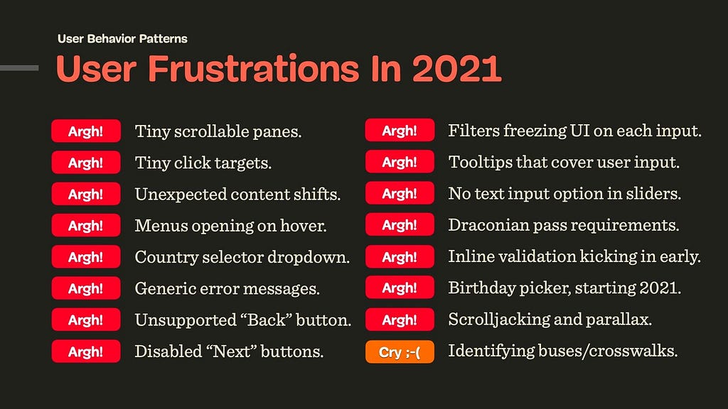
You’ve seen them before. Confusing and frustrating design patterns that seem to be chasing you everywhere you go, from one website to another. Perhaps it’s a disabled submit button that never communicates what’s actually wrong, or tooltips that — once opened — cover the input field just when you need to correct a mistake. They are everywhere, and they are annoying, often tossing us from one dead-end to another, in something that seems like a well-orchestrated and poorly designed mousetrap.
These patterns aren’t malicious nor evil. They don’t have much in common with or mysterious CAPTCHAs in disguise of fire hydrants and crosswalks. They aren’t designed with poor intentions or harm in mind either: nobody wakes up in the morning hoping to increase bounce rates or decrease conversion.
It’s just that over the years, some more-or-less random design decisions have become widely accepted and adopted, and hence they are repeated over and over again — often without being questioned or validated by data or usability testing. They’ve become established design patterns. And often quite poor ones. Showing up again and again and again among user complaints during testing.
In this new series of articles, let’s take a closer look at some of these frustrating design patterns and explore better alternatives, along with plenty of examples and questions to keep in mind when building or designing one. These insights are coming from user research and usability tests conducted by yours truly and colleagues in the community, and of course, they all will be referenced in each of the upcoming posts.
We’ll start with a humble and seemingly harmless pattern that we all had experienced at some point — the infamous birthday picker that too often happens to be inaccessible, slow and cumbersome to use.
We’ve written about in much detail already, but birthday pickers deserve a separate conversation.
Frustrating UX: Birthday Dropdown/Widgets Starting In 2021
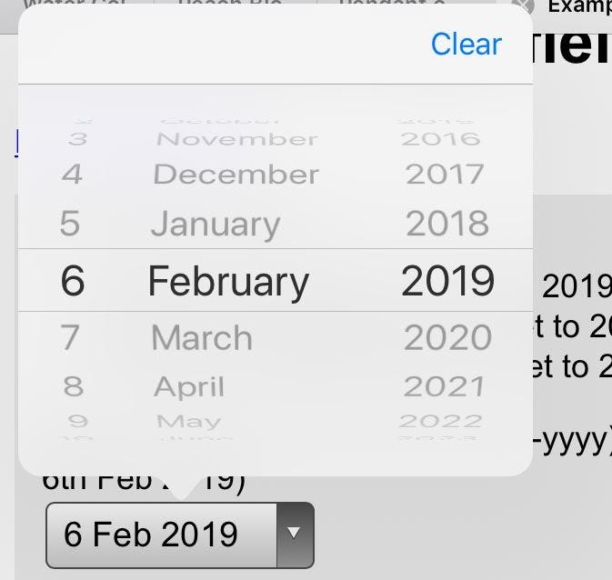
Every time you apply for a job application, open a bank account or book a flight, you probably will have to type in your date of birth. Obviously, the input is a date, and so it shouldn’t be very surprising to see interfaces using a well-adopted date-picker-calendar-alike widget (native or custom), or a drop-down to ask for that specific input.
We can probably spot the reasons why these options are often preferred. From the technical standpoint, we want to ensure that the input is correct, and catch errors early. Our validation has to be bulletproof enough to validate the input, provide a clear error message and explain what exactly the customer needs to do to fix it. We just don’t have all these issues with a dropdown or a calendar widget. Plus, we can easily prevent any locale or formatting differences by providing only the options that would fit the bill.
So it’s not uncommon to see , and usually replaced with buttons (e.g. for filters), toggles, segmented controls, or autocomplete boxes that combine the flexibility of a text box with the assurance of a <select>-box. Dropdowns aren’t bad per se; it’s just users spend way more time than necessary filling in the data in them.
And then there is a question about default values. While with dropdowns we often default to no input whatsoever (mm/dd/yyyy), with a date picker we need to provide some starting point for the calendar view. In the latter case, ironically, the “starting” date usually happens to be just around the date of when the form is filled, e.g. May 15th, 2021. This doesn’t appear optimal of course, but what should be the right date? We need to start somewhere, right?
Well, there really isn’t a right date though. We could start early or late, 3 months ago or tomorrow, but in the case of a birthday picker, all of these options are pure guesswork. And as such, they are somewhat frustrating: without any input, customers might need to scroll all the way from 1901 to the late 1980s, and with some input set, they’ll need to correct it, often jumping decades back and forth. That interaction will require impeccable precision in scrolling.
No matter what choice we make, we will be wrong almost all the time. This is likely to be different for a hotel booking website, or a food delivery service, and plenty of other use cases — just not birthday input. This brings us to the conversation about how to objectively evaluate how well-designed a form input is.
Evaluating The Quality Of Form Design
Design can be seen as a very subjective matter. After all, everybody seems to have their own opinion and preferences about the right approach for a given problem. But unlike any kind of self-expression or art, design is supposed to solve a problem. The question, then, is how well a particular design solves a particular problem. The more unambiguous the , the fewer mistakes customers make, the less they are interrupted, the better the design. These attributes are measurable and objective.
In my own experience, forms are the most difficult aspect of user experience. There are so many difficult facets from microcopy and form layout to inline validation and error messages. Getting forms right often requires surfacing back-end errors and third-party errors properly to the front-end and simplifying a complex underlying structure into a set of predictable and reasonable form fields. This can easily become a frustrating nightmare in complex legacy applications and third-party integrations.
So, when it comes to form design, in our projects, we always try to measure the quality of a particular solution based on the following 9 attributes:
Mental model
How well does our form design fit into the mental model of the customer? When asking for personal details, we need to ask exactly the minimum of what’s required for us to help our customers get started. We shouldn’t ask for any sensitive or personal details (gender, birthday, phone number) unless we have a good reason for it, and explain it in the UI.
Complexity
How many input elements do we display per page, on mobile and on desktop? If a form contains 70–80 input fields, rather than displaying them all on one page, or use a multi-column layout, it might be a good idea to use a to break down complexity into smaller, manageable chunks.
Speed of input
How much time and effort does the customer need to fill in data correctly? For a given input, how many taps/keystrokes/operations are required to complete the form with a given data accurately, assuming that no mistakes are done along the way.
Accessibility
When speaking about the speed of input, we need to ensure that we support various modes of interaction, primarily screen reader users and keyboard users. This means properly set labels, large buttons, labels placed above the input field, and errors properly communicated, among .
Scalability
If we ever needed to translate the UI to another language or adapt it for another form factor, how straightforward would it be, and how many issues will it cause? (A typical example of a problematic solution is a floating label pattern, and we’ll talk about it in a separate post.)
Severity of interruptions
How often do we interrupt customers, be it with loading spinners, early or late inline validation, freezing parts of the UI to adjust the interface based on provided UI (e.g. once a country is selected), the frequency of wrongly pre-filled data, or wrongly auto-corrected data?
Form success rate
How many customers successfully complete a form without a single mistake? If a form is well designed, a vast majority of customers shouldn’t ever see any errors at all. For example, this requires that we tap into browser’s auto-fill, the tab order is logical and making edits is conventional and obvious.
Speed of recovery
How high is the ratio of customers who succeed in discovering the error, fixing it, and moving along to the next step of the form? We need to track how often error messages appear, and what error messages are most common. That’s also why it’s often a good idea to drop by customer support and check with them first what customers often complain about.
Form failure rate
How many customers abandon the form? This usually happens not only because of the form’s complexity, but also because customers can’t find a way to fix an error due to aggressive validators or disabled “submit” buttons. It also happen happens because the form asks too much sensitive and personal information without a good reason.
To understand how well a form works, we run usability studies with customers accessing the interface on their own machine — be it mobile device, tablet, laptop or desktop — on their own OS, in their own browser. We ask to record the screen, if possible, and use a , to follow where and how and why mistakes happen. We also study how fast the customer is moving from one form field to another, when they pause and think, and when most mistakes happen.
Obviously, the sheer number of taps or clicks doesn’t always suggest that the input has been straightforward or cumbersome. But some modes of input might be more likely to generate errors or cause confusion, and others might be outliers, requiring just way more time compared to other options. That’s what we are looking for in tests.
Now, let’s see how we can apply it to the birthday input problem.
Designing A Better Birthday Input
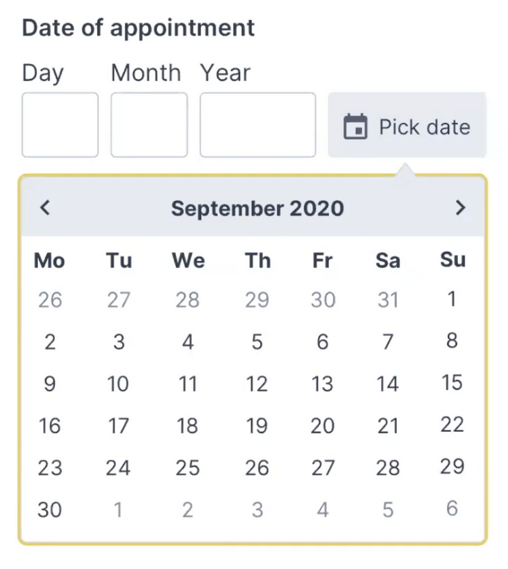
If somebody asks you for your birthday, you probably will have a particular string of digits in mind. It might be ordered in dd/mm/yyyy or mm/dd/yyyy, but it will be a string of 8 digits that you’ve been repeating in all kinds of documents since a very young age.
We can tap into this simple model of what a birthday input is with a simple, single-input field which would combine all three inputs — day, month, and year. That would mean that the user would just type a string of 8 numbers, staying on the keyboard all the time.
However, this approach brings up a few issues:
we need to support auto-formatting and masking,
we need to explain the position of the day/month input,
we need to support the behavior of the Backspace button across the input,
we need to track and hide/show/permanently display the masking,
we need to support jumps into a specific value (e.g. month),
we need to minimize rage clicks and navigation within the input to change a specific value on mobile devices,
If auto-making isn’t used, we need to come up with a set of clean-up and validation rules to support any kind of delimiters.
In his book on , Adam Silver argues that is rarely a good idea, but it is a goodoption for dates. We can clearly communicate what each input represents, and we can highlight the specific input with focus styles. Also, validation is much easier, and we can communicate easily what specific part of the input seems to be invalid, and how to fix it.
We could either automatically transition the user from one input to the next when the input is finished, or allow users to move between fields on their own. At the first glance, the former seems better as the input would require just 8 digits, typed one after another. However, when people fix errors, they often need input buffers — space within the input field to correct existing input.
For example, it’s common to see people typing in 01, realizing that they made a mistake, then changing the input to 010, and then removing the first 0, just to end up with a reversed (and correct) string — 10. By avoiding an automatic transition from one field to the next, we might be causing less trouble and making the just UI a bit more predictable and easy to deal with.
To explain the input, we’d need to provide labels for the day, month and year, and perhaps also show an example of the correct input. but could live comfortably above the input field, along with any hints or examples that we might want to display. Plus, every input could be highlighted on focus as well.
Over the years, I couldn’t spot a single problem with this solution throughout years of testing, and it’s not surprising the pattern as well.
When You Need A Date Picker After All
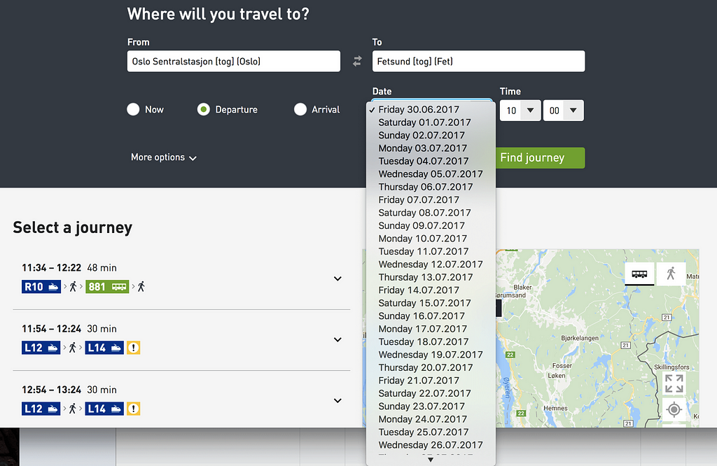
While the solution above is probably more than enough for a birthday input, it might not be good enough for more general situations. We might need a date input that’s less literal than a birth day, where customers will have to pick a day rather than provide it (e.g. “first Saturday in July”). For this case, we could enhance the three input fields with a calendar widget that users could use as well. A default input would depend on either the current date, or a future date that most customers tend to choose.
Adam provides a simple for the Memorable date pattern in his . It solves plenty of development work and avoids plenty of accessibility issues, and all of that by avoiding tapping around calendar widgets or unnecessary scrolling around dropdown wheels.
Wrapping Up
Of course, a good form control depends on the kind of date input that we are expecting. For trip planners, where we expect customers to select a date of arrival, a flexible input with a calendar look-up might be useful.
When we ask our customers about their date of birth though, we are asking for a very specific date — a very specific string, referring to an exact day, month, and year. In that case, a drop-down is unnecessary. Neither is a calendar look-up, defaulting to a more-or-less random value. If you do need one, avoid native date pickers and native drop-downs if possible and use an accessible custom solution instead. And rely on three simple input fields, with labels and explanations placed above the input field.
We’ve also published a lengthy opus on , along with checklists you might want to use to design or build one.
Related Articles
If you find this article useful, here’s an overview of similar articles we’ve published over the years — and a few more are coming your way.